A must-see for designers! 5 divine color schemes chosen by professionals
The "color scheme" greatly affects the quality of the design. Choosing the right color scheme can significantly improve visibility and brand image. In this article, we will introduce the "5 Divine Color Schemes" carefully selected by professional designers.
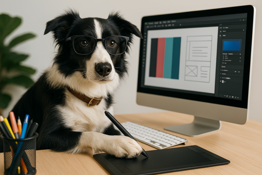
5 divine color schemes chosen by professionals
1. Modern × minimalist color scheme (monotone + accents)
Example configuration
- Main color: #2E2E2E (dark gray)
- Sub-color: #F5F5F5 (light gray)
- Accent color: #FF6B6B (coral red)
Features and Applications
The perfect color scheme for minimalist designs. While building on a monotone base, accent colors guide the gaze. Ideal for corporate websites and art portfolios.
Recommended use cases
- Web design for tech startups
- Modern UI Design
- Luxurious brand site
2. Natural & Organic Color Scheme (Earth Color)
Example configuration
- Main Color: #A68A64 (Sand Brown)
- Sub-color: #6B705C (olive green)
- Accent color: #DDBEA9 (beige pink)
Features and Applications
A color scheme that creates a natural and organic atmosphere. It features a calming tone, making it perfect for lifestyle brands and sustainable projects.
Recommended use cases
- Coffee shops and organic food brands
- Packaging design for natural cosmetics
- Environmental NPO site
3. Energetic × pop color scheme (vivid color)
Example configuration
- Main color: #FF4D6D (vivid pink)
- Sub-color: #FFC107 (sun yellow)
- Accent color: #3A86FF (cobalt blue)
Features and Applications
Perfect for pop designs for young people. It gives a bright and energetic impression, making it ideal for designing the entertainment industry and fashion brands.
Recommended use cases
- Banners for social media campaigns
- App icons and UI
- Street fashion brand branding
4. Luxurious × elegant color scheme (deep color)
Example configuration
- Main color: #4B2C5E (deep purple)
- Sub-color: #E5C1CD (rose gold)
- Accent color: #F5F3E7 (ivory)
Features and Applications
A color set that gives a sophisticated impression. Perfect for creating a high-end brand or luxury atmosphere.
Recommended use cases
- High-Brand Cosmetics Packaging
- Logo Design for Luxury Hotels and Restaurants
- Jewelry-related web design
5. Tech× Futuristic Color Scheme (Neon Color + Dark Mode)
Example configuration
- Main color: #0D1B2A (dark blue)
- Sub color: #1B263B (midnight blue)
- Accent color: #00A8E8 (neon blue)
Features and Applications
Color schemes suitable for technology and futuristic design. It creates a cyber atmosphere, making it ideal for digital services and gaming-related designs.
Recommended use cases
- Corporate website of an IT company
- Game Landing Page
- Hacker culture visual design
summary
The color scheme greatly determines the first impression of the design. Depending on your target and purpose, it is important to choose the right color palette. Please refer to the five color schemes introduced this time to find the "god color scheme" that suits your design!
Design Tips
- Be conscious of contrast to ensure visibility
- Keep it to about 3 to 4 colors to create a sense of unity
- Understand the psychological effects of color and choose the right color for your purpose
- As a professional designer, take advantage of these color schemes to create more sophisticated designs!