Common things in beverage packaging design
Hello,
"Pu ("Pu" is a half-width kana)".
(You don't have to pronounce the part of ("pu" is a half-width kana))
Suddenly, when you choose a drink at a convenience store or supermarket, are you conscious of the design of the packaging?
There are a wide variety of beverage packaging designs for each company, but each genre has its own image, and it's interesting to know what kind of drink it is just by looking at it.
In this article, I would like to explain various drinks from a design perspective.
Contents
- 1 Tea-based: Safe, Japanese, health-oriented
- 2 Carbonated drinks: Energy, stimulation, POP <
- a href="#i-2">3 Fruit juices: vivid and juicy
- 4 Conclusion
Contents
tea system: security, harmony, and health consciousness
The tea packaging has many calm colors overall, such as green, brown, and white.
Brush letters, Japanese patterns, and photographs of tea leaves are often used, and it is characterized by an atmosphere that values the "heart of Japan".
Green tea
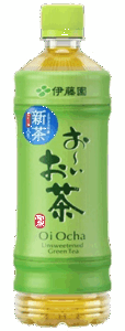
(quote: https://www.itoen.jp/products/45534/)
As for the color of the package, as the name suggests, many of them are based on "green".
Compared to other teas, it has a visually easy-to-understand design as "green tea".
Hojicha
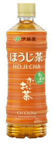
(quote: https://www.itoen.jp/products/41604/)
In order to express the roasted and savory image, brown and orange-based coloring is often used.
In addition, compared to green tea and barley tea, there are cases where horizontal letters are used or high-color designs reminiscent of the Taisho and Showa eras are used.
When I looked it up, I found out that hojicha began to be made in the early Taisho and Showa periods in order to make effective use of tea leaves that had deteriorated in quality.
It's very interesting to get a glimpse of the history of the product from the design.
Barley tea
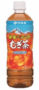
(quote: https://www.itoen.jp/products/41616/)
Barley tea is mainly in high demand at home, so compared to other teas, it is often used with a common and friendly design.
Carbonated drinks: energy, stimulation, POP feeling
Carbonated drinks often have vivid colors and crisp logos to evoke a fizzy stimulation, and moving graphics stand out.
In addition, by incorporating the expression of bubbles boiling into the packaging, a sizzling feeling is often expressed.
Cola
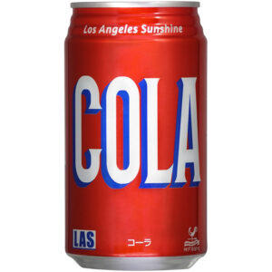
(quote: https://hapimo.jp/view/item/000000001872)
There are many different types of cola packaging, but basically stylish lines and cursive English are often used as logos, giving it a somewhat American feel.
I have the impression that many of them are mainly influenced by Coca-Cola's retro and sophisticated design.
Also, Coca-Cola and Pepsi-Cola, which are known as synonymous with Coke, are
While Coca-Cola has hardly changed its packaging design since its inception, Pepsi-Cola has changed its packaging design frequently.
If you are interested, please check it out.
Lemon carbonated
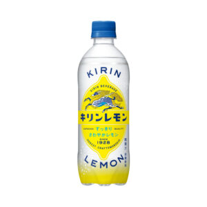
(quote: https://products.kirin.co.jp/softdrink/softdrink/detail.html?id=6890)
Many of the coloring colors are based onyellow, which is reminiscent of lemon, and blue, which has a refreshing image.
Among them, the Kirin Lemon mentioned above uses an old font that gives a somewhat nostalgic feel, making it impressive compared to other lemon drinks.
Kirin Lemon is a long-selling product launched in 1928, and it is also a product that claims to be safe from that time by "no coloring" and "pure sugar (pure sugar)".
This nostalgic design may have been adopted to impress customers with that sense of trust.
Energy Drinks
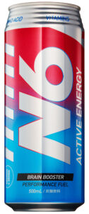
(quote: https://kiiva.co.jp/item/n6-energy-500ml/)
Narrow cans are often used with cyber-chic and stylish designs.
Since the target customer base is young people, it may be that they are required to have a stylish and cool design.
In recent years, there have been many cases where cool, colorful, and electric packaging designs have been adopted to enhance affinity with e-sports.
Fruit juice: vivid and juicy
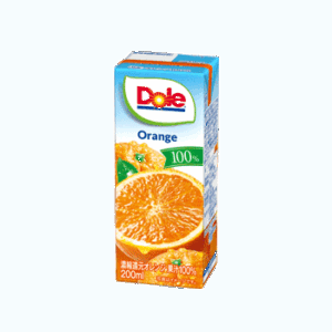
(quote: https://www.meg-snow.com/products/detail.php?p=dole_orange200)
Fruit juice drinks and fruit juices often use designs that express the unique color and freshness of fruits.
In addition, photos of fruits and realistic images are often used on the packaging so that it can be seen at a glance that it is a fruit drink.
In particular, 100% fruit juice is designed to convey a sense of safety and trust to customers, so the image of the fruit is conveyed more firmly.
summary
what did you think?
Stay tuned!