I thought about the characteristics of the package design ₍ ᐢ. ̫ .ᐢ ₎ ~Pharmaceuticals~
Hello,
Lately< I tend to lack sleep timebr/>
"Pu ("Pu" is a half-width kana)".
(You don't have to pronounce the part of ("pu" is a half-width kana)
(Due to lack of sleep, my rave skin is getting worse)
Suddenly, have you ever been concerned about the packaging design of the products that are overflowing around you?
I have.
It's a package design that I usually see casually, but
If you look closely, you will find that each product genre has different characteristics.
For example, if it is a food-related product, it can be
to increase appetite
The design consists of coloring centered on warm colors... etc.
"Pu" likes to look for the characteristics of such product packaging.
packaging design of "pharmaceuticals" and think about their characteristics.
Contents
- 1 "p" Impression of the pharmaceutical packaging 2 The design of "Pavlon" emphasizes conveying a sense of security
- 3 Expression of "Dikinin" from the package 4 Information on the drug package
- 5 Summary
- 6 Reference site
Contents
"p" have the impression of the drug package
I immediately went to a local pharmacy to find out the features of the package.
Ihave observed all kinds of medicines, and what many medicines have in common is that
- The amount of information on the package is very high The
- product logo is old-fashioned .
That was the point.
So, "P" tried to hypothesize these two points as follows.
- The amount of information on the package is very high
→ To correctly convey the benefits and ingredients of the drug and prevent customers from making mistakes with the desired product?
The - product logo is old-fashioned
→ to show a "sense of trust" that people have been familiar with since ancient times?
So, what is the intention involved in the actual product design?
"Pavlon" design with an emphasis on conveying a sense of security
First, let's take a look at the design of the comprehensive cold medicine "Pavlon" sold by Taisho Pharmaceutical.
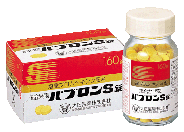
Pavlon's design is produced by the design department within Taisho Pharmaceutical.
In designing the packaging of drugs such as Pavlon, the design department of Taisho Pharmaceutical uses
It seems that "sense of security", "trust", and "effectiveness" are important.
For example, when it comes to logos, the solid and down-to-earth font expresses Pavlon's "sense of security".
Also, regarding the coloring, since 'Pavlon Granules' released in 1977,
The red, gold, and white color scheme is used in the design as a common identity.
Pablo's long-standing "trust" is expressed in its old-fashioned logo and coloring.
As for the "effect", it seems that the image of the "S" letter fluttering at the top of the package of Pavlon S and the sharp image of "AX" in Pavlon AX express "immediate effect".
I've always had the impression that the letter "S" is "a great alter ego~", but I was surprised that it expressed an immediate effect.
By the way, "Pu", I once drank too much Pavlon and my head was popping~.
I found out that drinking too much Pablon is not good for the brain.
Expression of uniqueness seen from the packaging of "Dikinin"
As a second example, let's take a look at the design of the comprehensive cold medicine "Dikinin" sold by Zenyaku Industries.
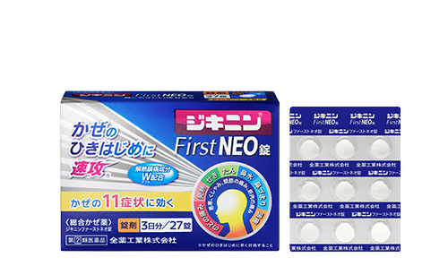
This product features a vibrant pink color on the background of the logo.
This is because it has increased the visibility of the long-used logo to show its credibility as a long-selling brand that has been around since 1958.
Like Pavlon, it seems that it expresses a "sense of trust" by using an image that has been used for a long time.
Also, by using sharp lines in the background, it is expressed that "it works quickly at the beginning of a cold".
Information on the drug package
Whenpurchasing medicines, the most important thing for customers is the "functionality" of the product.
There are various types of medicines, including those that are effective for headaches and those that reduce fever.
Therefore, in the packaging of medicines, it is important to accurately convey what kind of symptoms the product is effective for.
The reason why there is a lot of information is to convey the functions of the product to customers better.
In addition, "visibility" is very important in conveying information.
In order to prevent patients from mismistaking the name and to understand the efficacy of the drug at a glance, the text and content labels are often written in a larger and more prominent way.
summary
what did you think?
The features of the packaging of the drug are as follows:
- "Sense of security", "trust", and "sense of effectiveness" are important.
By using long-standing logos and coloring, the product expresses a sense of security and trust. - When purchasing medicines, customers value the "functionality" of the product
In order to accurately convey functionality, the amount of information on the package inevitably
In addition, "visibility" is valued in conveying information, such as making the necessary information prominent
Package design is profound.
reference site
Taisho Pharmaceutical Pavlon Part 2
https://blog.excite.co.jp/dezagen/10079941/
Taisho Pharmaceutical Pavlon Part 3
https://blog.excite.co.jp/dezagen/10090428/
Sato's design is used in the product packaging of the cold medicine brand "Dikinin"
https://www.sato.co.jp/about/news/2023/release/20230302_01.html
What are the design characteristics of pharmaceuticals, cosmetics, and demand?
https://www.togu.co.jp/column/detail/102
Be careful when ordering! About the features and types of medical packaging design
https://rekaizen.com/article/detail/package-desing/11107