I compared the old site design with the recent one design.°ʚ(* ́꒳'*)ɞ°.
Hello,
"Pu ("Pu" is a half-width kana)".
(You don't have to pronounce the part of ("pu" is a half-width kana))
Suddenly, are you an internet old man?
I don't fit into the old Internet elderly, but I think it applies to the middle-aged Internet people.
Even now, I dance to popular songs on "Nico Nico Douga" every night.
As a middle-aged Internet person, I get very happy when I find a site with an obviously old design while surfing the Internet.
Three-dimensional design buttons, a large number of banners, a sidebar that stands at the edge of the screen...
When I find elements that are being driven out of recent site design, I can't help but smile.
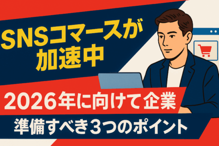
In this article, I would like to compare the characteristics of old site design with modern site design.
Characteristics of Old Site Design
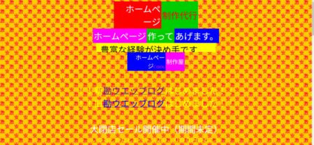
The color scheme is flashy
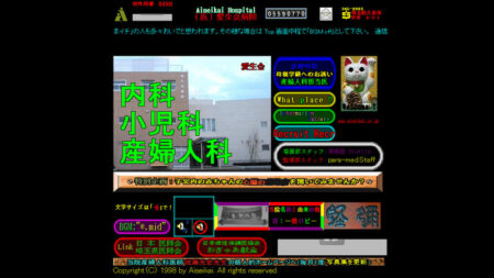 the legendary site "Aiseikai Hospital" (no longer exists) in the early days of the Internet
The design is impressive with colors that hurt your eyes
Many of the old sites have designs that make you think they are flashy at first glance.
Some of the sites consisted of text in primary colors (red, blue, and yellow) with unnecessary flashing and other animations on a pitch black background, and there were also sites with designs that seemed to cause eye strain in an instant.
The above-mentioned "Aiseikai Hospital" became a hot topic for a while because it was so flashy that it was hard to believe that it was a hospital website, and it is still talked about as a "legendary site" today.
Background is a pattern
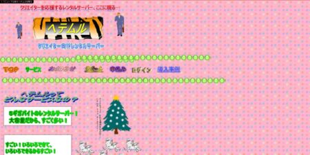 Rental Server "Hetemul" is part of the April Fool's Day project
Old site-style design page created
Older sites tend to have a background with patterns.
It is no exaggeration to say that in the old Internet era, the administrators of personal websites embodied their individuality by setting eye-catching image patterns in the background.
Even now, there are many sites that use simple patterns such as polka dots and striped patterns as backgrounds, but the patterns used on sites at the time, which were "standout wins", had a large number of colors and complex patterns (of course, there were many sites with simple patterns), and in some cases, "grandma's tablecloth" or " There was also a site that looked like "bad taste Animal Crossing house wallpaper".
Tends to use a lot of animation
 "Website Builder" is so
The flashy color scheme and animations are impressive
Animations in which text flows from right to left and GIF illustrations that move at the edges of the screen are essential points for old sites.
Unlike today's sites, there were many sites that implemented animations because they wanted to make their sites look flashy.
aforementioned "Aiseikai Hospital" and the above-mentioned "website production company" use too much animation and are in an extremely chaotic situation.
You want to be careful not to overdo anything.
*The website of the "Website Builder" still exists, but the animation is too flashy, so please be sure to browse away from the screen in a bright room. I browsed in a bright room and felt sick
The decoration of the letters is rugged
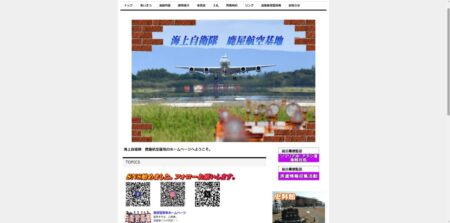 is the site of the Maritime Self-Defense Force Kanoya Air Base.
It's an old-fashioned design, but I feel the atmosphere in the QR code where "X" is written.
The headlines of the old site are just flashy. The thick font is packed with decorations.
There were many sites with so many jumbled characters that I didn't know about unity and readability.
Also, the letters tend to lean towards something. I think the economy is good because it is rising steadily.
Recent Site Design Features
(Quoted from "Web Design Quality Sample Book" (Ryoko Kubota, SB Creative Co., Ltd.))
Fluid Shape
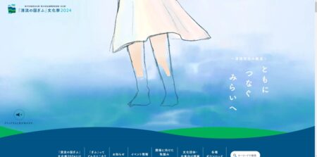
"Clear Stream no Kunigifu" Cultural Festival 2024 (https://gifu-bunkasai2024.pref.gifu.lg.jp/koku-shou-bunsai/)
The purity and gentleness of the water flow are expressed in a fluid shape.
have seen this "fluid shape" on various sites.
It is also used on our TOP page.
The flat design used everywhere in recent years has the disadvantage of giving a sense of inorganicness, but
By using this fluid shape, it is possible to create a soft impression on a simple site.
advantage is that it can be used for all kinds of purposes, such as backgrounds, borders, and photo masks.
Vivid gradients
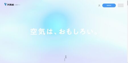 Atmospheric New Graduate Recruitment Site (https://www.taikisha.co.jp/recruit/)
By using a gradient based on light blue against the background, it expresses a sense of atmosphere.
Gradients tended to be used a lot on the old Internet, but in fact they have been attracting renewed attention in recent years.
The big difference between the past and the present is that "stylishness" is emphasized.
Rather than just using gradients to make them stand out, they are used to harmonize with the surrounding image by paying attention to the color and usage.
Handwritten typography
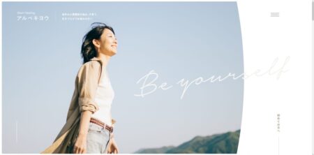 Albekiyo (https://arubekiyou.com/)
The design gives a sense of familiarity by putting handwritten letters on the top.
including text as a decoration, such as written with a pen or pencil, you can express strength and friendliness.
It can also be used in conjunction with simple fonts that are highly readable such as Gothic fonts to add sharpness to the screen.
3D graphics
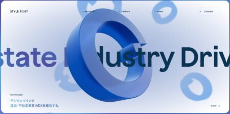 Styleport Co., Ltd. https://styleport.co.jp/)
3D animation is used on top
By using 3D graphics, it is possible to create a visual impact.
In addition, animations can be added with depth compared to 2D, allowing you to express an original worldview.
It can be implemented by using JavaScript called "Three.js".
Click here for an article about "Three.js"
summary
what did you think?
Design is profound.
It's good that both old and modern sites have their own merits.
After all, it seems that I can't quit the Internet.