【procreate】Thick coat style? Making illustrations that look like it even if they are rough [iPad]
Hello,
"Pu ("Pu" is a half-width kana)".
(You don't have to pronounce the part of ("pu" is a half-width kana))
Suddenly, I love drawing.
At the same time, he is a very rough person.
It's amazing to be able to draw high-quality and detailed pictures.
I am often surprised to see the paintings of the divine painter that he is particular about such details~.
But I'm so stubborn that other people pull back, so I can't draw pictures with such a commitment.
This time, I will introduce illustration making that looks like that even for me who is rough.
By the way, the equipment I use is an iPad and the app is "procreate".
I recommend buying it all at a time because you can do a lot of things at a low price.
Contents
Contents
Please watch the video first!
This is my illustration making video.
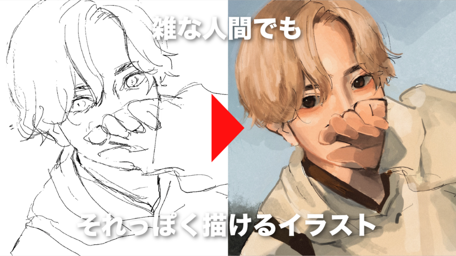
This time I used my selfie to draw a picture.
see, the details are insanely messy.
But if you look at it from a distance of about 2 meters from the screen, I think it looks like that.
(1) Rough draft

draft the overall picture of the picture.
This time, I use a pen that does not apply pressure, but I am not particular about it.
I think any thin pen will do.
(2) Rough color coding

This is also roughly divided into colors that look like them while looking at the original photos.

The layers are divided into hair, skin, clothes (1), and clothes (2).
It is easier to separate them when adding shadows.
By the way, I don't draw line drawings because I'm rough. Because I can't concentrate.
I think it's probably that kind of disease. Is it a disease that can't draw line drawings?
(3) Rough shadowing

will roughly add shadows and backgrounds.
When drawing shadows, for example, if you want to add shadows to your hair,
If you create an "alpha lock" on the hair layer or a layer on top and clip it to the hair layer
It is convenient because you can add color without protruding from a pre-painted area.
By the way, the pen I often use is "Spectra".
It is convenient because it can be used for lines if used thinner, and used for painting if used thicker.

(4) Apply more and more from the top

roughly finished adding the color, create a layer on top and
Paint while referring to the original image.
add detailed shadow expressions and pupil writing from above.
As I say many times, I'm sloppy, so I only paint the details in a way that looks like that.
However, the things that can be seen in the foreground, such as the face, are depicted in relatively detail.
By doing so, it will look good even if everything else is messy.


apply more and more from the top like this.
Another thing to note is that the light should be painted in warm colors with a yellowish tint, and the shadows should be painted in cool colors with a bluish tint.
By doing so, the feeling of flatness in the illustration is eliminated and three-dimensional expression is possible.
(5) Complete with a rough texture!

Finally, add the "Noise" texture from "Adjustment" and you're done!
summary
what did you think?
Illustrations are profound.