[Created by Reiwa] Nostalgic and new! The charm of Y2K design ( ́•ᴥ•') [Heisei relics]
Hello,
"Pu ("Pu" is a half-width kana)".
(You don't have to pronounce the part of ("pu" is a half-width kana))
It's sudden, but fashion and items reminiscent of "Heisei" are popular among young children these days.
Every time I see a girl wearing loose socks or a short T-shirt, I feel that fashion really comes full circle.
Also, since I was born in the late 90s, I am a little shocked that young people have a nostalgic image of "Heisei".
This time, I will explain the nostalgic but new design "Y2K" that gives you a sense of the "Heisei" era.
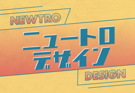
What is Y2K design?
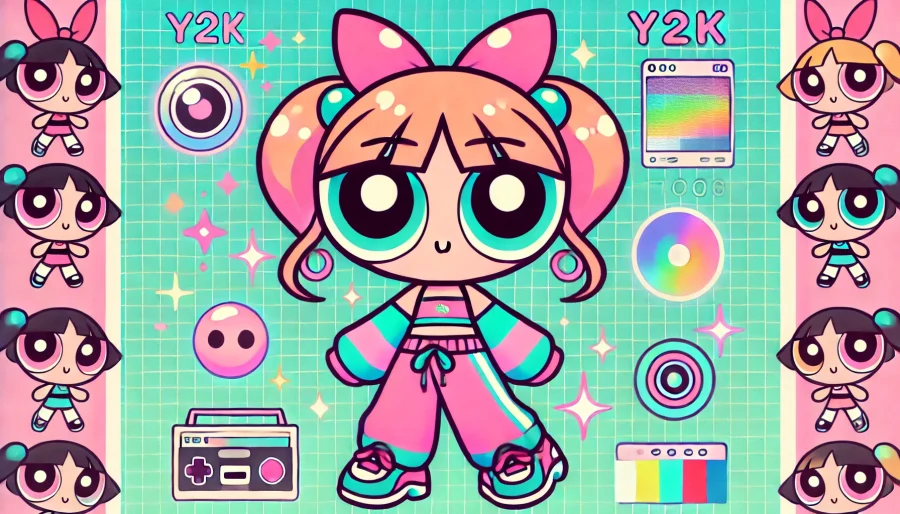
First of all, Y2K design is a design that expresses the "futuristic" and "technological sense" of the early 2000s.
It reflects the "future image" that people had at the time, and is characterized by vivid colors, textures, and gradients.
is nostalgic for people who lived in Heisei, and on the contrary, it is considered a novel design for young people living in Reiwa, and it is a design that is currently attracting attention.
Y2K Design Features
Vivid and bold colors
 (Reference: Meidensha ( https://www.meidensha.co.jp/knowledge/takingaction/anatanotonari/ ))
Y2K designs often use strong vivid colors such as cyber blues and purples, futuristic silvers, and cyber greens, as well as neon and metallic colors.
These shades convey a futuristic feel of the 21st century, resulting in a visually striking design.
Metallic and 3D textures
Anotherfeature of y2k design is that metallic and 3D textures are used extensively.
Looking back, the logos and icons of old Apple products were characterized by three-dimensional designs.
Three-dimensional text, logos, icons, etc., and the use of shiny metallic-like textures creates a futuristic atmosphere.
Now that flat design has become mainstream, it feels strange that design with depth is being revived.
Reflection and light effects
Byadding reflections and shadows to text and graphics, it emphasizes the cyber and three-dimensional feel.
Glossy highlights and reflective effects can create a more "futuristic and magical feel."
Use gradients
The design of the time used a lot of smooth gradients. The transition of colors, from blue to purple and from pink to orange, creates a futuristic and energetic atmosphere. Using gradients in backgrounds, buttons, and titles on posters and ads can make the entire design polished and Y2K-like.
Retro and digital fonts

(Reference: Kayak (https://www.meidensha.co.jp/knowledge/takingaction/anatanotonari/))
By using display fonts, pixel fonts, and fonts like digital clocks, you can create a cyber or mechanical feel.
Although it is a kayak site, there are many gimmicks that will impress the old people on the Internet, so please take a look.
summary
what did you think?
Y2K design is deep.