[All people] Design hinders barrier-free! ? [About easy-to-use design]
Hello,
"Pu ("Pu" is a half-width kana)".
(You don't have to pronounce the part of ("pu" is a half-width kana))
One day, while looking at X (formerly Twitter), I saw a post with the following content.
"In recent buildings, there is a tendency to hide firefighting equipment by prioritizing design, but since it is intended to be used in an emergency, it is natural to design it in a conspicuous way."
The post with such content was pasted with an image of a certain university's fire extinguishing equipment.


(Quote: https://x.com/inlet_labo/status/1497551193177935872)
If youlook at the image like this, you can see that the door that hides the fire extinguisher has the same wood grain pattern as the wall, and the design is certainly less noticeable.
This seems to make you confused about finding a fire extinguisher in case of emergency.
In this way, sometimes the superiority of design can interfere with the original use.
Beautiful and stylish designs are eye-catching, but neglecting practicality and functionality can cause inconvenience and trouble.
In this article, I would like to consider the harmful effects of design from two perspectives: "emergency response" and "barrier-free".
Contents
design that inhibits emergency response
Designing that prioritizes appearance can be fatal
Example: Difficult to understand the location of disaster prevention equipment and information displays

(Quote: Incomprehensible sign. Is the toilet on the right? Straight? | Information board at Shinjuku Station https://shinkicom.exblog.jp/16595250)
Sometimes the information and the location of the equipment are not noticeable because the design is too important.
For example, the above site cites the information board of Shinjuku Station as an example.
The square panels are neatly arranged and the design is high, but the grouping by location is not properly divided, so
The route to the destination is very difficult to understand.
lack of consideration for barrier-free
Good design may be a barrier for someone other than yourself
Example: Lack of consideration for the visually impaired
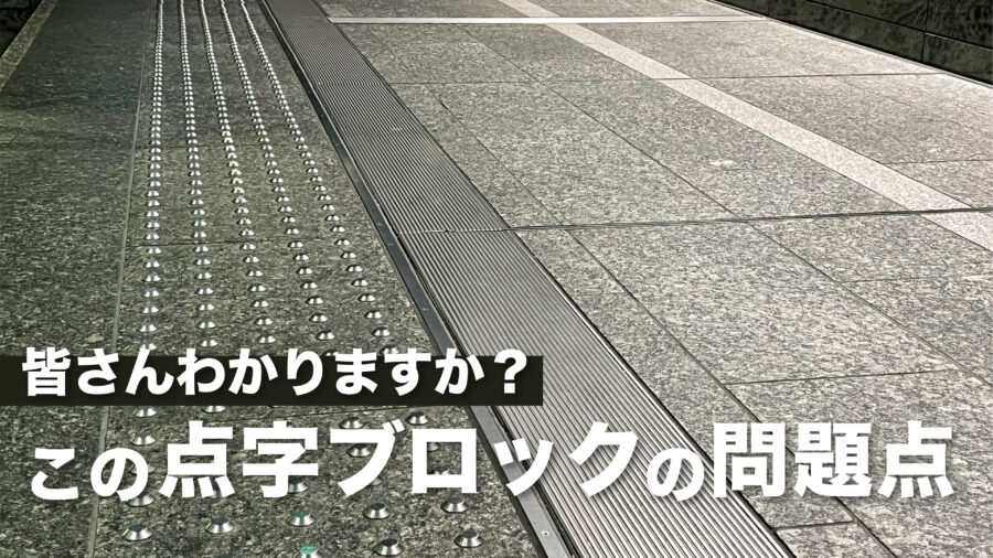
Do you know why braille blocks are yellow?
Yellow is frequently used for braille blocks due to its high visibility for people with low vision.
In fact, people from visually impaired organizations are calling for the use of yellow for braille blocks.
(Quote: Maeko News "Social Braille block, yellow is good"https://mainichi.jp/maisho/articles/20171121/kei/00s/00s/002000c)
However, in some cases, Braille blocks are laid out that ignore the voices of the parties involved because of the emphasis on design.
Since there is no Braille block or background color mentioned above, people with low vision cannot immediately notice that there is a Braille block here.
Visually impaired = not completely blind, and some people can distinguish their surroundings by color, so you have to be careful about the color scheme.
summary
what did you think?
I understood once again that a design that is easy for a variety of people to use in various situations is truly excellent design.